Data bars unleashed - colours, gantt charts and more.
Data bars in Excel are a form of conditional formatting that makes it easy to visualise the values in a range of cells, by shading a portion of the cell proportional to the value in it. On their own they are pretty useful but have a few limitations, but by harnessing a little known ‘feature’ with a little bit of VBA code and some creative thinking they can be made much more useful.
At their very simplest (which coincidentally is about all you can do with them by default) data bars assume zero (0) as the minimum value and the highest value as 100%, and scale all the bars accordingly (figure 1). If there are negative values that becomes the minimum value and a zero reference line is included. You can change the bar colour and set whether the bars go left to right or right to left (the bar context), and fool around with the borders and a few other things, but that’s about it.
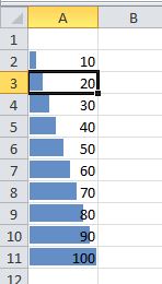 Figure 1
There are at least two key limitations of data bars:
- It’s not possible to have multiple colours in a set of bars (other than distinguishing between negative and positive values).
- Data bars seem ideally suited to constructing simple Gantt charts, but it isn’t possible to mix bar context, in turn limiting their usefulness for this purpose.
Multiple colours
To tackle the colour problem, imagine a scenario(1) in which you have a set of actual and target values, and you want to colour the bars red where actual is less than target, and green where actual equals or exceeds target. These might be something like sales figures or production targets, for example. A simple example is shown in Figure 2. In column D I’ve also calculated the ratio of actual to plan as column B divided by column C, which gives a set of values for the data bars to use.
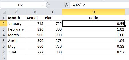 Figure 2
Step 1 Now to generate the data bars - first the red ones. Select D2:D7, then on the Home tab click Conditional Formatting->Data bars->More rules. Set the bar colour to red and click OK. In my example I’ve left the values showing but if you don’t want that tick the box to ‘Show Bar Only’. You should get the result as shown in Figure 3.
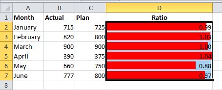 Figure 3
Step 2 To make the red bars only apply where target has not been met, we need to use a bit of VBA code. Hold down the ALT key and press F11 to bring up the VBA editor. If you can’t see the ‘Immediate’ window hold down CTRL and press G, or click View->Immediate Window. In that window type the following statement and press ENTER:
selection.formatconditions(1).formula=“=if($d2<1,true,false)”
Alternatively you can do a direct comparison of the input values:
selection.formatconditions(1).formula=“=if($b2<$c2,true,false)”
This works by setting the conditions in which the red bars apply. Crucially the last data bar created becomes the default format conditions, so if you have more than one to do it’s not possible to save it all until the end and then use formatconditions (1), formatconditions(2) etc. It has to be done immediately after creating the data bar. If you’ve done everything correctly so far it should look like figure 4, where some of the bars have now disappeared because they don’t meet our applied condition.
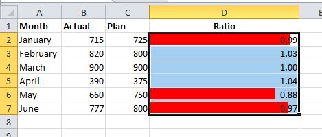 Figure 4
Now repeat steps 1 and 2 above, setting the bar colour to green in step 1, and setting the formula in step 2 to:
selection.formatconditions(1).formula=“=if($d2>=1,true,false)”
The VBA statement in this case sets the conditions in which the green bars apply, which funnily enough is when the red bars don’t, and the final result is shown in figure 5.
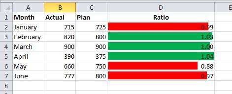 Figure 5
Gantt charts and changing bar context
Once you understand the basic principle of setting the conditions in which certain bars apply, the method becomes pretty versatile. Excel often gets used to construct simple Gantt charts, but one of the problems is that with basic conditional formatting there is no way to shade part of a cell, so an activity that begins and/or ends part way through a month can’t be accurately represented. The ability of data bars to shade part of a cell seems like a great solution(2), except that by default you can’t set the context to be right to left at the beginning and left to right at the end.
For this example, we have a typical setup of start and finish dates (columns A and B) and months along the top (C1:N1). I’ve entered the proportion values for the data bars manually but in practice a formula would do this job (Figure 6).
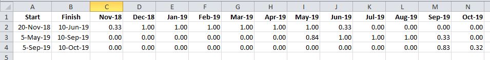 Figure 6
Now set the first group of data bars (Figure 7) by selecting C2:N4 and creating an initial default data bar. On the Home tab click Conditional Formatting->Data bars->More rules and click OK. Switch off the values if you prefer. As you can see, this gets us most of the way there but the first months bar for each row has the wrong context.
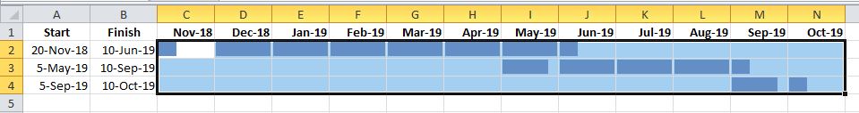 Figure 7
Now repeat the previous step but set the colour to something different (say green) and the context as right to left (Figure 8).
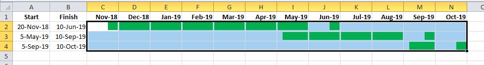 Figure 8
All that remains is to set a condition on the green bars to have them apply only at the beginning. Press ALT+F11 and in the VBA Immediate window type:
selection.formatconditions(1).formula=“=if(c$1<=$a2,true,false)”
which will produce the result in Figure 9.
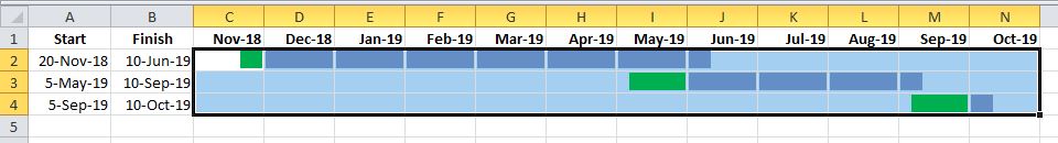 Figure 9
To finish it off, edit the conditional formatting rule for the green bars to set them back to blue. Conditional formatting->Manage rules-> Select the green bar and click Edit Rule. Change the colour to blue (Figure 10).
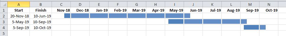 Figure 10
(1)The colours question
on the Answers forum.
(2)The Gantt chart question on the Answers forum.
